Housekeeping rules

  • Please mute your microphone when you are not speaking
  • Please turn off your camera during presentations – the session is being recorded
  • Post your questions in the chat or raise your hand using the “raise your hand” function in Zoom (“Reactions” button)
  • Tell us how we did in the survey (more about that later)
  • The presentation will be shared afterwards

About me

Dr. Franz Eder

Assoc. Prof. for International Relations

University of Innsbruck


Research focus: Foreign and Security Policy; (Counter-)Terrorism; USA, Europe, Austria; social science research methods (v.a. QTA, DNA); academic writing and presentation; open and reproducible science
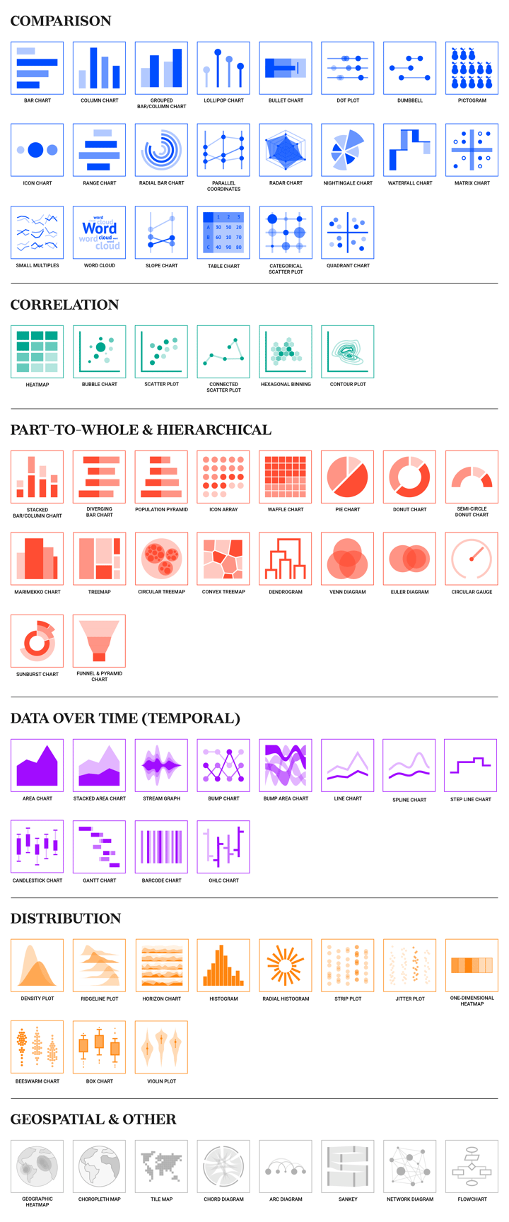

Foreign Policy Lab

AFP3

AUSSDA

Structure

  1. What is a “visualization”?

  2. Process of visualizing data

  3. RStudio/Jupyter and ggplot2

  4. Example from European Values Study

Books

Schwabish (2021)

Schwabish (2021)

Wickham (2024)

Wickham (2024)

What is “visualization”?

Definitions

Visualization

“A visualization is any kind of visual representation of information designed to enable communication, analysis, discovery, exploration, etc” [emphasis by FE] (Cairo 2016, 28).

Infographics

“An infographic is a multi-section visual representation of information intended to communicate one or more specific messages. Infographics are made of a mix of charts, maps, illustrations, and text (or sound) that provides explanation and context.” [emphasis by FE] (Cairo 2016, 31).

Purpose of visualizations

“The purpose of infographics and data visualizations is to enlighten people–not to entertain them, not to sell them products, services, or ideas, but to inform them.” [Hervorhebung durch FE] (Cairo 2016, 13).

Communication

“[It, FE] is about drawing and organizing lines and shapes to communicate a specific bit of science-related information to another person… [It, FE] is about using imagery in the service of communication” (Christiansen 2023, 13).

Understanding

“data visualisation aims to facilitate understanding” (Kirk 2019, 20).

Three phases of understanding (Kirk 2019, 20)

perceiving

interpreting

comprehending

source: Kirk (2019), p. 23

source: Kirk (2019), p. 23

source: Kirk (2019), p. 21

source: Kirk (2019), p. 21

Criteria for good visualizations

Principles of Graphical Excellence (Tufte 2007, 51)

  1. “Graphical excellence is the well-designed presentation of interesting data–a matter of substance, of statistics, and of design.”
  2. “Graphical excellence consists of complex ideas communicated with clarity, precision, and efficiency.”
  3. “Graphical excellence is that which gives to the viewer the greatest number of ideas in the shortest time with the least ink in the smallest space.”

Cairo (2016), p. 12 und Kirk (2019), p. 38

  • truthful (see also D’Ignazio and Klein (2020))
  • functional and accessible
  • insightful and enlightening
  • elegant and beautiful

Simplicity vs complexity

“Any visualization is a model” (Cairo 2016, 69)

  • “Good models abstract reality while keeping its essence at the same time… The more adequately a model fits whatever it stands for without being needlessly complex, and the easier it is for its intended audience to interpret it correctly, the better it will be.” (Cairo 2016, 70)
  • “Simplicity is about subtracting the obvious and adding the meaningful.” (Cairo 2016, 97)
  • “Good visualizations shouldn’t oversimplify information. They need to clarify it. In many cases, clarifying a subject requires increasing the amount of information, not reducing it.” (Cairo 2016, 78)
  • “Simplicity isn’t just about reduction. It can (and should) also be about augmentation. It consists of removing what isn’t relevant from our models but also of bringing in those elements that are essential to making those models truer.” (Cairo 2016, 97)

Preattentative Processing

Use preattentive attributes to direct observer’s focus.

source: Schwabish (2021), p. 26

source: Schwabish (2021), p. 26

Process of visualizing data

Building blocks

Visual “[r]epresentation involves making decisions about how you are going to portray your data visually so that the subject understanding it offers can be made accessible to your audience. In simple terms, this is all about charts and the act of selecting the right chart to show the features of your data that you think are most relevant.” (Kirk 2019, 17)

Building blocks of any visualization (Kirk 2019, 17–18):

  • marks: Elements used to represent items of data (i.e. points, columns, lines, etc.)
  • attributes: visual variations of marks to represent the values associated with each (text, color, shape, etc.)

4 phases of the visualization design process

see Kirk (2019, 32)

Phase 1: concept

planing and defining project

Phase 2: data

gathering, handling and preparing your data; getting to know the data

Phase 3: "editorial thinking"

defining what you will show your audience; what do we want to communicate (main message)

Phase 4: "Design" (see Schwabish 2021, 29–45)

  • show the data
  • reduce the clutter

source: Schwabish (2021), p. 32

source: Schwabish (2021), p. 32

source: Schwabish (2021), p. 33

source: Schwabish (2021), p. 33
  • integrate the graphics and text
    • remove legend (if possible) and label data directly
    • titles like newspaper headlines
    • add explainers

  • avoid the “spaghetti chart”
  • start with gray

RStudio/Jupyter and ggplot2

Grammar of Graphics

“A grammar of graphics is a tool that enables us to concisely describe the components of a graphic. Such a grammar allows us to move beyond named graphics (e.g., the”scatterplot”) and gain insight into the deep structure that underlies statistical graphics.” (Wickham 2010, 3)

Wickham (2010), p. 6

Wickham (2010), p. 6

ggplot2 – layered graphics


plot = datamapping


mappings comprise 5 elements

  • layer: collection of geometric elements (geoms) und statistical transformations (stats)
  • scales: display of values (colors, shapes, size) and axis
  • coord: coordination system
  • facet: splitting data into subsets
  • theme: “design” of the plots (background color, fonts, etc.)

Plotting with ggplot2

  • ggplot2 code consists of three components: (1) data, (2) aesthetic mapping, (3) geom function
require(tidyverse) # loading the tidyverse package

ggplot(data = starwars, aes(x = height, y = mass)) +
    geom_point()

starwars |> filter(mass < 500) |> 
    ggplot(aes(height, mass, color = gender)) +
    geom_point()

ggplot(starwars, aes(gender, height)) +
    geom_violin() +
    geom_jitter(color = "#005c8b", alpha = 0.5) +
    theme_minimal()

Example from European Values Study

Phase 1: Concept


Research question: “How tolerant has Austrian society become over time?”


How to measure tolerance?

Phase 2: Data

Kritzinger, Sylvia; Aichholzer, Julian; Glavanovits, Josef; Hajdinjak, Sanja; Klaiber, Judith; Seewann, Lena; Friesl, Christian; Zulehner, Paul M., 2019, “European Values Study 1990-2018 Austria Longitudinal Data (SUF edition)”, https://doi.org/10.11587/C4YBOT, AUSSDA, V1.

Questionnaire: 10044_qu_en_v1_0.pdf

Codebook/Method report

Variable: Justifiable: homosexuality

Variable: Wave

Variable: Sex

Phase 3: “Editorial thinking”

see Section 6.1 for code

see Section 6.1 for code
  • only 2 out of 10 categories
  • variance by gender?
  • danger of spaghetti chart (2 x 10 categories)
  • show the data?

Phase 4: Design

Configuration

require(pacman) # R package management tool 

p_load(tidyverse,
       showtext, #  using non-standard fonts in R graphs (extrafonts)
       Cairo, # embed fonts in graphs
       ggtext, # for coloring title in plots
       sjlabelled, # for using SPSS labels
       dataverse # for API access to AUSSDA/Dataverse
)

Load and tidy data

## Specifying the API Token we received from AUSSDA
Sys.setenv("DATAVERSE_KEY" = "xyz")

df_evs <-
  get_dataframe_by_name(
    filename    = "10048_da_en_v1_0-1.tab",
    dataset     = "10.11587/C4YBOT",
    .f          = haven::read_dta, # for reading SPSS tab file
    original    = TRUE,
    server      = "data.aussda.at")

df <- df_evs |> select(Year = S002EVS,
                       Sex = X001,
                       Homosexuality = F118) # select variables and rename them


head(df)
# A tibble: 6 × 3
  Year      Sex        Homosexuality          
  <dbl+lbl> <dbl+lbl>  <dbl+lbl>              
1 3 [1999]  1 [Male]   10 [Always justifiable]
2 5 [2018]  2 [Female]  6 [6]                 
3 3 [1999]  1 [Male]   10 [Always justifiable]
4 3 [1999]  2 [Female] 10 [Always justifiable]
5 2 [1990]  2 [Female]  3 [3]                 
6 4 [2008]  2 [Female]  3 [3]                 

Step 1

df |> group_by(Sex, Year) |> 
    ggplot(aes(Year, Homosexuality)) +
    geom_point()

Step 2

df |> group_by(Sex, Year) |> 
    ggplot(aes(as_label(Year), as_label(Homosexuality), color = as_label(Sex))) +
    geom_jitter() +
    theme_minimal()

Step 3

p <- df |>
    filter(!is.na(Homosexuality)) |> 
    group_by(Sex, Year) |> 
    
    mutate(mean_Homosexuality =
               mean(Homosexuality,
                    na.rm = TRUE)) |> 
    
    ggplot(aes(as_label(Year),
               as_label(Homosexuality),
               color = as_label(Sex))) +
    
    scale_color_manual(values =
                           c("#005c8b",
                             "#E69F00")) +
    
    geom_jitter(alpha = .3) +
    
    geom_point(aes(y = mean_Homosexuality,
                   color = as_label(Sex)),
               size = 5) +
    
    geom_point(aes(y = mean_Homosexuality),
               size = 2, color = "white") +
    
    labs(x = "", y = "") +
    theme_minimal()

p

Step 4

fontfamily1 <- "Roboto" # fonts have to be installed on the computer
fontfamily2 <- "Roboto Condensed"

p <- p + labs(title = "<b>Austrian <span style = 'color: #E69F00;'>women</span>
              lead the way for <span style = 'color: #005c8b;'>men</span> towards more 
              tolerance</b>") +
    labs(subtitle = "Q: Please tell me whether you think homosexuality can always be justified,
         never be justified or something in between.") +
    labs(caption = "Source: European Values Study 1990-2018; Austria Longitudinal Data") +
    theme(text = element_text(size = 14, family = fontfamily1),
          title = element_text(size = 18, family = fontfamily1),
          plot.title = element_text(size = 18, family = fontfamily1), 
          plot.subtitle =  element_markdown(size = 14, family = fontfamily2,
                                            margin = ggplot2::margin(1, 0, 1, 0)),
          axis.text.x = element_text(size = 12, family = fontfamily1), 
          axis.text.y = element_text(size = 12, family = fontfamily1), 
          plot.caption = element_text(size = 10, family = fontfamily1, color = "darkgrey")) +
    theme(plot.title = element_markdown(),
          plot.subtitle = element_markdown(),
          plot.caption = element_markdown(),
          panel.grid.major.x = element_blank(), 
          panel.grid.minor.y = element_blank(),
          legend.position="none") 

Final Plot

Final code (including saving plot)

png(filename = "plots/plot_homosexuality-final.png", 
    width = 21.7, 
    height = 10.2, 
    units = "in", 
    res = 300,
    bg = "#ffffff", 
    type = "cairo-png"
)

df |> filter(!is.na(Homosexuality)) |> 
    group_by(Sex, Year) |> 
    mutate(mean_Homosexuality = mean(Homosexuality, na.rm = TRUE)) |> 
    ggplot(aes(as_label(Year), as_label(Homosexuality), color = as_label(Sex))) +
    scale_color_manual(values = c("#005c8b", "#E69F00")) +
    geom_jitter(alpha = .3) +
    geom_point(aes(y = mean_Homosexuality, color = as_label(Sex)), size = 5) +
    geom_point(aes(y = mean_Homosexuality), size = 2, color = "white") +
    labs(x = "", y = "") +
    labs(title = "<b>Austrian <span style = 'color: #E69F00;'>women</span> lead the way for <span style = 'color: #005c8b;'>men</span> towards more tolerance</b>") +
    labs(subtitle = "Q: Please tell me whether you think homosexuality can always be justified, never be justified</span> or something in between.") +
    labs(caption = "Source: European Values Study 1990-2018; Austria Longitudinal Data") +
    theme_minimal() +
    theme(text = element_text(size = 14, family = fontfamily1),
          title = element_text(size = 18, family = fontfamily1),
          plot.title = element_text(size = 18, family = fontfamily1), 
          plot.subtitle =  element_markdown(size = 14, family = fontfamily2, margin = ggplot2::margin(1, 0, 1, 0)),
          axis.text.x = element_text(size = 12, family = fontfamily1), 
          axis.text.y = element_text(size = 12, family = fontfamily1), 
          plot.caption = element_text(size = 10, family = fontfamily1, color = "darkgrey")) +
    theme(plot.title = element_markdown(),
          plot.subtitle = element_markdown(),
          plot.caption = element_markdown(),
          panel.grid.major.x = element_blank(), 
          panel.grid.minor.y = element_blank(),
          legend.position="none") 

dev.off()

Bibliography

Cairo, Alberto. 2016. The Truthful Art: Data, Charts, and Maps for Communication. Indianapolis, IN: New Riders.
Christiansen, Jen. 2023. Building Science Graphics: An Illustrated Guide to Communicating Science Through Diagrams and Visualizations. Boca Raton, FL: CRC Press. https://doi.org/10.1201/9781003217817.
D’Ignazio, Catherine, and Lauren F. Klein. 2020. Data Feminism. Cambridge, MA: The MIT Press. https://doi.org/10.7551/mitpress/11805.001.0001.
Kirk, Andy. 2019. Data Visualisation: A Handbook for Data Driven Design. 2nd ed. London et al.: Sage.
Schwabish, Jonathan. 2021. Better Data Visualizations: A Guide for Scholars, Researchers, and Wonks. New York, NY: Columbia University Press.
Tufte, Edward R. 2007. The Visual Display of Quantitative Information. 2nd ed. Cheshire, CT: Graphic Press.
Wickham, Hadley. 2010. “A Layered Grammar of Graphics.” Journal of Computational and Graphical Statistics 19 (1): 3–28. https://doi.org/10.1198/jcgs.2009.07098.
———. 2024. Ggplot2: Elegant Graphics for Data Analysis. 3rd ed. Heidelberg: Springer. https://ggplot2-book.org/.
Wilkinson, Leland. 2005. The Grammar of Graphics. 2nd ed. New York, NY: Springer. https://doi.org/10.1007/0-387-28695-0.

Q & A

Feedback

Upcoming Events

Appendix

geom_line plot

# define font families for title, subtitel and annotations
fontfamily1 <- "Roboto"
fontfamily2 <- "Roboto Condensed"

df |> filter(Homosexuality == 10 | Homosexuality == 1) |> 
    pivot_longer(cols = c(Homosexuality)) |> 
    group_by(Year, value) |> 
    summarise(n = n()) |> 
    mutate(N = max(cumsum(n)), freq = n/N) |> 
    ggplot(aes(x = as_label(Year), y = freq, group = as_label(value), color = as_label(value))) +
    scale_color_manual(values = c("#005c8b", "#E69F00")) +
    geom_line(linewidth = 2) +
    geom_point(size = 4) +
    geom_point(size = 2, color = "white") +
    scale_y_continuous(labels = scales::percent, limits = c(0,1)) +
    labs(x = "", y = "") +
    labs(title = "<b>Austrians have become more tolerant over time</b>") +
    labs(subtitle = "Q: Please tell me whether you think homosexuality can <b><span style = 'color: #E69F00;'>always be justified</span></b>, <b><span style = 'color: #005c8b;'>never be justified</span></b> or something in between.") +
    labs(caption = "Source: European Values Study 1990-2018; Austria Longitudinal Data") +
    theme_minimal() +
    theme(text = element_text(size = 14, family = fontfamily1),
          title = element_text(size = 18, family = fontfamily1),
          plot.title = element_text(size = 18, family = fontfamily1), 
          plot.subtitle =  element_markdown(size = 14, family = fontfamily2, margin = ggplot2::margin(1, 0, 1, 0)),
          axis.text.x = element_text(size = 12, family = fontfamily1), 
          axis.text.y = element_text(size = 12, family = fontfamily1), 
          plot.caption = element_text(size = 10, family = fontfamily1, color = "darkgrey")) +
    theme(plot.title = element_markdown(),
          plot.subtitle = element_markdown(),
          panel.grid.major.x = element_blank(), 
          panel.grid.minor.y = element_blank(),
          legend.position="none")